This isn't the same font, I admit, but I wanted to at LEAST destroy the absurd claim that proportional fonts didn't exist way back in 1972. This font also doesn't have the curved apostrophe and probably some other issues, but I know there are font balls available on ebay. Go look for yourself.
This newsletter was created by my father, Tom Underwood, back in 1966. He was the minister at Cherokee Christian Church, in Prairie Village, Kansas.
I admit that he passed away back in 1985, so you'll just have to trust me on that one. The newsletter was typed by his secretary. It was done on the office IBM Selectric electric typewriter [update: I am told it was probably not a Selectric model but probably an Executive model]. The newsletter was printed on an offset press that we had at the church. It was like a mimeograph machine, but it used inks. It did NOT have any sort of typesetting capacity. I used to play on my dad's IBM
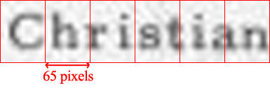
Really is a proportional font. Promise!
Click on the image to see the BIG PICTURE.


Now can we PLEASE get back to THE WHOLE POINT BEHIND this recent media explosion about George W. Bush and the Air National Guard?
Thanks!